
How data visualization informs decisions and connects DreamSpring’s mission with the community
In October, DreamSpring’s Chief Operations & Innovation Officer presented at the sold-out Opportunity Finance Network (OFN) National Conference in Washington, D.C. on the importance of data visualization for Community Development Financial Institutions (CDFIs). The session was delivered in partnership with peer CDFI small business lenders LiftFund and Pacific Community Ventures. With more than 85 years of combined economic development experience, our organizations are committed to impact analysis and leveraging data in new and unique ways to better inform internal and external decisions.
What is data visualization and why does it matter to CDFIs?
|
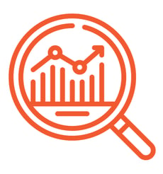
Data visualization is the process (some may call it an art and a science) of converting raw data into visually appealing content — presentations, charts, graphs, and infographics. Since many CDFIs are nonprofits that collect demographic and financial information on the clients we serve, we often have significant amounts of data that can be used to tell our story and inform our decisions. Data visualization can help people — from philanthropic supporters to investors and even staff — quickly understand who are and what we do. |
|

How does DreamSpring use data visualization in practice?
We start by using data visuals to simplify complex information, converting statistics and lengthy financial worksheets into easily digestible images that can be shared across teams and with our partners and funders. These charts transform our data into engaging content pieces that eventually make their way into our marketing materials and thought leadership presentations.
|
|
Data visualizations are like illustrations in a story; these images bridge the gap between experts and novices and enable us to share our impact in a way that is more tangible. We use data visualizations in reports and in conversation with partners, peers, and teams. Our data sets help us build effective strategic plans, set goals and key performance indicators, and evaluate performance. |
What is the value of data visuals vs. raw data?
The simplified nature of visualized data enhances retention — if you see a chart with a disparity, you’re more likely to remember the visual than if you read the statistic. The human brain is naturally wired to process and recall visual information better, so we are taking our data and making it memorable!
|
Sometimes raw data struggles to tell the whole story; data visualizations can paint powerful pictures and enable us to better see trends and patterns that might otherwise be missed. Because of this, we leverage our data visualizations to track and monitor progress, see if there are trends in our lending and client services, and make informed decisions. If the visualization seems weird, it may mean there is an issue in the raw data, and we can identify an issue that may otherwise be missed! |
|
How does DreamSpring build data visualizations?
 |
DreamSpring uses a host of software to build our visualizations, including HubSpot and DOMO, but even charting in Excel or simple tools can begin to tell a story. Data visualization isn’t about building the perfect image or making the data pretty; it's about transforming data into a format that provides meaningful insights into our work — improving decisioning and engaging stakeholders for maximum impact. |
Want to learn more about data visualization or DreamSpring’s high-impact lending? Contact our team.